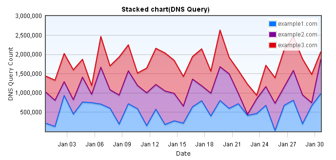
Stacked chart not only shows the trends over time, you can also see the
cumulative sum of all data. We use DNS queries of three domains in one month as
data source.
Stacked chart(DNS Query)
Stacked chart data
Because Flot doesn`t support stacked chart directly, so we have to include jquery.flot.stack.js plugin, the required files are listed below.
<script type="text/javascript" src="/js/jquery-1.8.3.min.js"></script>
<!--[if lte IE 8]><script language="javascript" type="text/javascript" src="/js/flot/excanvas.min.js"></script><![endif]-->
<script type="text/javascript" src="/js/flot/jquery.flot.js"></script>
<script type="text/javascript" src="/js/flot/jquery.flot.axislabels.js"></script>
<script type="text/javascript" src="/js/flot/jquery.flot.stack.js"></script>
<script type="text/javascript" src="/js/flot/jshashtable-2.1.js"></script>
<script type="text/javascript" src="/js/flot/jquery.numberformatter-1.2.3.min.js"></script>
    var data = [
        [gd(2012, 1, 1), 208557], [gd(2012, 1, 2), 125068], [gd(2012, 1, 3), 931208], [gd(2012, 1, 4), 450040],
        [gd(2012, 1, 5), 761180], [gd(2012, 1, 6), 744526], [gd(2012, 1, 7), 707095], [gd(2012, 1, 8), 601316],
        [gd(2012, 1, 9), 187495], [gd(2012, 1, 10), 716189], [gd(2012, 1, 11), 587141], [gd(2012, 1, 12), 147266],
        [gd(2012, 1, 13), 574670], [gd(2012, 1, 14), 175881], [gd(2012, 1, 15), 272519], [gd(2012, 1, 16), 211131],
        [gd(2012, 1, 17), 637015], [gd(2012, 1, 18), 794050], [gd(2012, 1, 19), 399010], [gd(2012, 1, 20), 799942],
        [gd(2012, 1, 21), 595768], [gd(2012, 1, 22), 717126], [gd(2012, 1, 23), 414923], [gd(2012, 1, 24), 462479],
        [gd(2012, 1, 25), 674334], [gd(2012, 1, 26), 20312], [gd(2012, 1, 27), 675892], [gd(2012, 1, 28), 808655],
        [gd(2012, 1, 29), 194543], [gd(2012, 1, 30), 664716], [gd(2012, 1, 31), 980720]
    ];

    function gd(year, month, day) {
        return new Date(year, month - 1, day).getTime();
    }
Stacked chart options
When we`re making stacked chart, we need to set series.stack to true, the chart will come out as stacked chart, also, we`re making a stacked line chart, so we can set series.lines.fill to true, to fill the shape with colors, you can see the codes below.
    series: {
        stack: true,
        lines: {
            show: true,
            fill: true
        }
    }
We also use yaxis.tickFormatter to format the tick labels. Below is the codes of x-axis and y-axis in the options.
    xaxis: {
        mode: "time",
        tickSize: [3, "day"],
        tickLength: 10,
        color: "black",
        axisLabel: "Date",
        axisLabelUseCanvas: true,
        axisLabelFontSizePixels: 12,
        axisLabelFontFamily: 'Verdana, Arial',
        axisLabelPadding: 10
    }

    yaxis: {
        color: "black",
        axisLabel: "DNS Query Count",
        axisLabelUseCanvas: true,
        axisLabelFontSizePixels: 12,
        axisLabelFontFamily: 'Verdana, Arial',
        axisLabelPadding: 3,
        tickFormatter: function (v, axis) {
            return $.formatNumber(v, { format: "#,###", locale: "us" });
        }
    }
    grid: {
        hoverable: true,
        borderWidth: 2,
        backgroundColor: { colors: ["#EDF5FF", "#ffffff"] }
    }
The final step
In the end, we call $.plot and pass dataset and options into it, then it`s done. Making a stacked line chart, in fact, is to make a line chart with the options series.stack set to true and series.lines.fill set to true, this is relatively easy. We will show you how to make stacked bar chart and horizontal stacked bar chart below.
    $(document).ready(function () {
        $.plot($("#flot-placeholder"), dataset, options);
        $("#flot-placeholder").UseTooltip();
    });
Stacked bar chart
    series: {
        stack: true,
        bars: {
            show: true
        }
    }

    bars: {
        align: "center",
        barWidth:24 * 60 * 60 * 600
    }
Stacked horizontal bar chart
    var data = [
        [569106, gd(2012, 1, 1)], [743944, gd(2012, 1, 2)], [120865, gd(2012, 1, 3)], [890208, gd(2012, 1, 4)],
        [259723, gd(2012, 1, 5)], [177150, gd(2012, 1, 6)], [32430, gd(2012, 1, 7)], [274054, gd(2012, 1, 8)],
        [63435, gd(2012, 1, 9)], [994514, gd(2012, 1, 10)], [885453, gd(2012, 1, 11)], [289791, gd(2012, 1, 12)],
        [411717, gd(2012, 1, 13)], [95324, gd(2012, 1, 14)], [646479, gd(2012, 1, 15)], [448868, gd(2012, 1, 16)],
        [669678, gd(2012, 1, 17)], [909944, gd(2012, 1, 18)], [675965, gd(2012, 1, 19)], [281272, gd(2012, 1, 20)],
        [629781, gd(2012, 1, 21)], [330138, gd(2012, 1, 22)], [802835, gd(2012, 1, 23)], [139079, gd(2012, 1, 24)],
        [187101, gd(2012, 1, 25)], [354332, gd(2012, 1, 26)], [361090, gd(2012, 1, 27)], [78171, gd(2012, 1, 28)],
        [452212, gd(2012, 1, 29)], [404369, gd(2012, 1, 30)], [63509, gd(2012, 1, 31)]
    ];
    var options2 = {
        series: {
            stack: true,
            bars: {
                show: true
            }
        },
        bars: {
            lineWidth: 1,
            barWidth: 24 * 60 * 60 * 450,
            horizontal: true
        },
        xaxis: {
            color: "black",
            axisLabel: "Date",
            axisLabelUseCanvas: true,
            axisLabelFontSizePixels: 12,
            axisLabelFontFamily: 'Verdana, Arial',
            axisLabelPadding: 10,
            tickFormatter: function (v, axis) {
                return $.formatNumber(v, { format: "#,###", locale: "us" });
            }
        },
        yaxis: {
            mode: "time",
            tickSize: [3, "day"],
            min: gd(2012, 1, 1),
            max: gd(2012, 1, 31),
            tickLength: 10,
            color: "black",
            axisLabel: "DNS Query Count",
            axisLabelUseCanvas: true,
            axisLabelFontSizePixels: 12,
            axisLabelFontFamily: 'Verdana, Arial',
            axisLabelPadding: 3
        },
        grid: {
            hoverable: true,
            borderWidth: 2,
            backgroundColor: { colors: ["#EDF5FF", "#ffffff"] }
        }
    };