The line chart is most often used chart,
aslo the easiest to make, it shows trends over time, visualizes data and
information, so users can know how exactly these numbers are relate to each
other in one glance. Because this is the frist chart in our Flot tutorial, we
will show you completely how to make a line chart. We use gold price as example,
we will use monthly price and chage rate as the data source.
Steps for making a line chart
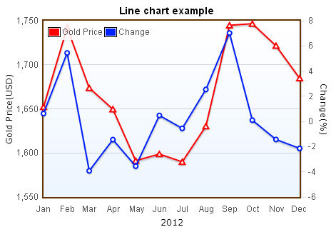
Line chart example
Include files Flot required
The files that need to be included and put into <head>, the first one is jQuery.js, the second one is jquery.flot.js, because we`re making time series chart so next you need to include jquery.flot.time.js.The last two files and jquery.flot.axislabels.js are plugins for Flot. By default, the data point symbol is circle, in order to change the shape of a data point, we added jquery.flot.symbol.js. In addition, Flot doesn`t support axis labels, so we added jquery.flot.axislabels.js plugin to configure axis labels.
The codes below is the required including files.
        <script type="text/javascript" src="/js/jquery-1.8.3.min.js"></script>
         <!--[if lte IE 8]><script language="javascript" type="text/javascript" src="/js/flot/excanvas.min.js"></script><![endif]-->
        <script type="text/javascript" src="/js/flot/jquery.flot.js"></script>
        <script type="text/javascript" src="/js/flot/jquery.flot.time.js"></script>
        <script type="text/javascript" src="/js/flot/jquery.flot.symbol.js"></script>
        <script type="text/javascript" src="/js/flot/jquery.flot.axislabels.js"></script>
HTML5 canvas support
If you`re using Internet Explorer, and the version is 8 or below, you probably couldn`t see Flot chart functioning well, that`s because IE doesn`t support HTML5 canvas, but there is a workaround, you can make IE support HTML5 canvas by including excanvas.min.js plugin. you can download excanvas.js in here.Put a placeholder in page
After including files is done, now you have to decide where you want your charts to appear, you can insert <div> inside of <body> as a placeholder, and specify an id to it, this is where the chart will be inserted. Remember to give your chart a width and a height or else it could cause script error like "Uncaught Invalid dimensions for plot, width = 0, height = 0".
<div id="flot-placeholder" style="width:300px;height:150px"></div>
Creating data
The data is the most important part of making any charts, if the data is wrong the chart will come out incorrect, in this example we use gold price and change rate.
        //Gold Price
        var data1 = [
            [gd(2012, 0, 1), 1652.21], [gd(2012, 1, 1), 1742.14], [gd(2012, 2, 1), 1673.77], [gd(2012, 3, 1), 1649.69],
            [gd(2012, 4, 1), 1591.19], [gd(2012, 5, 1), 1598.76], [gd(2012, 6, 1), 1589.90], [gd(2012, 7, 1), 1630.31],
            [gd(2012, 8, 1), 1744.81], [gd(2012, 9, 1), 1746.58], [gd(2012, 10, 1), 1721.64], [gd(2012, 11, 1), 1684.76]
        ];

        //Change
        var data2 = [
            [gd(2012, 0, 1), 0.63], [gd(2012, 1, 1), 5.44], [gd(2012, 2, 1), -3.92], [gd(2012, 3, 1), -1.44],
            [gd(2012, 4, 1), -3.55], [gd(2012, 5, 1), 0.48], [gd(2012, 6, 1), -0.55], [gd(2012, 7, 1), 2.54],
            [gd(2012, 8, 1), 7.02], [gd(2012, 9, 1), 0.10], [gd(2012, 10, 1), -1.43], [gd(2012, 11, 1), -2.14]
        ];

        var dataset = [
            { label: "Gold Price", data: data1, points: { symbol: "triangle"} },
            { label: "Change", data: data2, yaxis: 2 }
        ];
The data1 format is like
[gd(2012, 0, 1), 1652.21]
[1325347200000, 1652.21]
        function gd(year, month, day) {
            return new Date(year, month, day).getTime();
        }
After we finished creating two data sources, now we can put tyem into an array call dataset, then we can set their labels with the values "Gold Price" and"Change", and in the data attribute we set it to data1 and data2. In the dataset, data attribute is a must-have, it can`t be omitted. We also use points attribute, we set points.symbol with the value "triangle", it means that the data point symbol will be shown in a triangle shape.
        var dataset = [
            { label: "Gold Price", data: data1, points: { symbol: "triangle"} },  //first data seires
            { label: "Change", data: data2, yaxis: 2 }                            //second data seires
        ];
Customizing axes
We`ve already completed 80% of drawing, next we can customize the look of the chart, Flot provides a lot of attributes to make you customize the look and the details of the chart, in here we only tell you how to customize the axes.Because we`re making time series chart, and time series data is in x-axis, so you have to set xaxis.mode with the value "time", after you set it , Flot will interpret the data of x-axis as datetime object.
We`re also making changes to xaxis.tickSize, the tickSize can be set with a number or an array, when you set it with the value 2, the tick labels will be shown like 2, 4, 6, .., when you set it with the value 3, the tick labels will become 3, 6, 9, and so on. When you set it with an array, like tickSize: [1, "month"], tick labels will be shown in Jan, Feb, Mar, ..., besides the value "month", there are also "day"、"year"、"hour" you can choose.
Because Flot doesn`t support axis label, so we included jquery.flot.axislabels.js plugin in the beginning. The axis label is that the labels to be shown around the charts either in x-axis or y-axis. xaxis.axisLabel is the text that will be shown, and axis.axisLabelFontSizePixels is used for font size, xaxis.axisLabelUseCanvas means that whether the axis label should be plotted by using HTML5 canvas. Below is the cods of this example...
        xaxis: {
            mode: "time",
            tickSize: [1, "month"],
            tickLength: 0,
            axisLabel: "2012",
            axisLabelUseCanvas: true,
            axisLabelFontSizePixels: 12,
            axisLabelFontFamily: 'Verdana, Arial',
            axisLabelPadding: 10
        },
        yaxes: [{
                axisLabel: "Gold Price(USD)",
                axisLabelUseCanvas: true,
                axisLabelFontSizePixels: 12,
                axisLabelFontFamily: 'Verdana, Arial',
                axisLabelPadding: 3,
                tickFormatter: function (v, axis) {
                    return $.formatNumber(v, { format: "#,###", locale: "us" });
                }
            }, {
                position: "right",
                axisLabel: "Change(%)",
                axisLabelUseCanvas: true,
                axisLabelFontSizePixels: 12,
                axisLabelFontFamily: 'Verdana, Arial',
                axisLabelPadding: 3
            }
        ]
        xaxis: {},
        yaxis: {}
        xaxis: {},
        yaxes: [
            {
                //first yaxis
            },{
                //second yaxis
            }
        ]
The final step
This is the last step and the easiest part of making a line chart, just pass dataset and options into $.plot, then you have your self a line chart. If you`re not familiar with $.plot function you can go back to Making your first chart.Making a Flot chart is easy, we will show you how to make bar charts、pie charts and area charts in the following chapters, you will become increasingly adept at making Flot charts!
        $(document).ready(function () {
            $.plot($("#flot-placeholder"), dataset, options);
        });
Below is the complete codes of this example
<!DOCTYPE html PUBLIC "-//W3C//DTD XHTML 1.0 Transitional//EN" "http://www.w3.org/TR/xhtml1/DTD/xhtml1-transitional.dtd">

<html xmlns="http://www.w3.org/1999/xhtml">
<head>
    <title></title>
    <script src="/js/lib/jquery-1.8.3.min.js" type='text/javascript'></script>
    <!--[if lte IE 8]><script language="javascript" type="text/javascript" src="/js/flot/excanvas.min.js"></script><![endif]-->

    <script type="text/javascript" src="/js/flot/jquery.flot.min.js"></script>
    <script type="text/javascript" src="/js/flot/jquery.flot.time.js"></script>
    <script type="text/javascript" src="/js/flot/jquery.flot.symbol.js"></script>
    <script type="text/javascript" src="/js/flot/jquery.flot.axislabels.js"></script>
    <script type="text/javascript" src="/js/flot/jshashtable-2.1.js"></script>
    <script type="text/javascript" src="/js/flot/jquery.numberformatter-1.2.3.min.js"></script>


    <script>
        //******* 2012 Gold Price Chart
        var data1 = [
            [gd(2012, 0, 1), 1652.21], [gd(2012, 1, 1), 1742.14], [gd(2012, 2, 1), 1673.77], [gd(2012, 3, 1), 1649.69],
            [gd(2012, 4, 1), 1591.19], [gd(2012, 5, 1), 1598.76], [gd(2012, 6, 1), 1589.90], [gd(2012, 7, 1), 1630.31],
            [gd(2012, 8, 1), 1744.81], [gd(2012, 9, 1), 1746.58], [gd(2012, 10, 1), 1721.64], [gd(2012, 11, 2), 1684.76]
        ];

        var data2 = [
            [gd(2012, 0, 1), 0.63], [gd(2012, 1, 1), 5.44], [gd(2012, 2, 1), -3.92], [gd(2012, 3, 1), -1.44],
            [gd(2012, 4, 1), -3.55], [gd(2012, 5, 1), 0.48], [gd(2012, 6, 1), -0.55], [gd(2012, 7, 1), 2.54],
            [gd(2012, 8, 1), 7.02], [gd(2012, 9, 1), 0.10], [gd(2012, 10, 1), -1.43], [gd(2012, 11, 2), -2.14]
        ];
        var dataset = [
            { label: "Gold Price", data: data1, points: { symbol: "triangle"} },
            { label: "Change", data: data2, yaxis: 2 }
        ];

        var options = {
            series: {
                lines: {
                    show: true
                },
                points: {
                    radius: 3,
                    fill: true,
                    show: true
                }
            },
            xaxis: {
                mode: "time",
                tickSize: [1, "month"],
                tickLength: 0,
                axisLabel: "2012",
                axisLabelUseCanvas: true,
                axisLabelFontSizePixels: 12,
                axisLabelFontFamily: 'Verdana, Arial',
                axisLabelPadding: 10
            },
            yaxes: [{
                axisLabel: "Gold Price(USD)",
                axisLabelUseCanvas: true,
                axisLabelFontSizePixels: 12,
                axisLabelFontFamily: 'Verdana, Arial',
                axisLabelPadding: 3,
                tickFormatter: function (v, axis) {
                    return $.formatNumber(v, { format: "#,###", locale: "us" });
                }
            }, {
                position: "right",
                axisLabel: "Change(%)",
                axisLabelUseCanvas: true,
                axisLabelFontSizePixels: 12,
                axisLabelFontFamily: 'Verdana, Arial',
                axisLabelPadding: 3
            }
          ],
            legend: {
                noColumns: 0,
                labelBoxBorderColor: "#000000",
                position: "nw"
            },
            grid: {
                hoverable: true,
                borderWidth: 2,
                borderColor: "#633200",
                backgroundColor: { colors: ["#ffffff", "#EDF5FF"] }
            },
            colors: ["#FF0000", "#0022FF"]
        };

        $(document).ready(function () {
            $.plot($("#flot-placeholder1"), dataset, options);
            $("#flot-placeholder1").UseTooltip();
        });


        function gd(year, month, day) {
            return new Date(year, month, day).getTime();
        }

        var previousPoint = null, previousLabel = null;
        var monthNames = ["Jan", "Feb", "Mar", "Apr", "May", "Jun", "Jul", "Aug", "Sep", "Oct", "Nov", "Dec"];

        $.fn.UseTooltip = function () {
            $(this).bind("plothover", function (event, pos, item) {
                if (item) {
                    if ((previousLabel != item.series.label) || (previousPoint != item.dataIndex)) {
                        previousPoint = item.dataIndex;
                        previousLabel = item.series.label;
                        $("#tooltip").remove();

                        var x = item.datapoint[0];
                        var y = item.datapoint[1];

                        var color = item.series.color;
                        var month = new Date(x).getMonth();

                        //console.log(item);

                        if (item.seriesIndex == 0) {
                            showTooltip(item.pageX,
                            item.pageY,
                            color,
                            "<strong>" + item.series.label + "</strong><br>" + monthNames[month] + " : <strong>" + y + "</strong>(USD)");
                        } else {
                            showTooltip(item.pageX,
                            item.pageY,
                            color,
                            "<strong>" + item.series.label + "</strong><br>" + monthNames[month] + " : <strong>" + y + "</strong>(%)");
                        }
                    }
                } else {
                    $("#tooltip").remove();
                    previousPoint = null;
                }
            });
        };

        function showTooltip(x, y, color, contents) {
            $('<div id="tooltip">' + contents + '</div>').css({
                position: 'absolute',
                display: 'none',
                top: y - 40,
                left: x - 120,
                border: '2px solid ' + color,
                padding: '3px',
                'font-size': '9px',
                'border-radius': '5px',
                'background-color': '#fff',
                'font-family': 'Verdana, Arial, Helvetica, Tahoma, sans-serif',
                opacity: 0.9
            }).appendTo("body").fadeIn(200);
        }
    </script>
</head>
<body>
    <div style="width:450px;height:300px;text-align:center;margin:10px">
        <div id="flot-placeholder1" style="width:100%;height:100%;"></div>
    </div>
</body>
</html>