When you finished reading the previous chapters, we believe that you are pretty
knowledgeable in making line charts or bar charts now. In this chapter we will
show you how to put lines and bars chart in one chart, if you are not familiar
with the previous chatpers, you can go back to
How to make Flot line chart and How to make Flot bar chart
before you read this chapter.
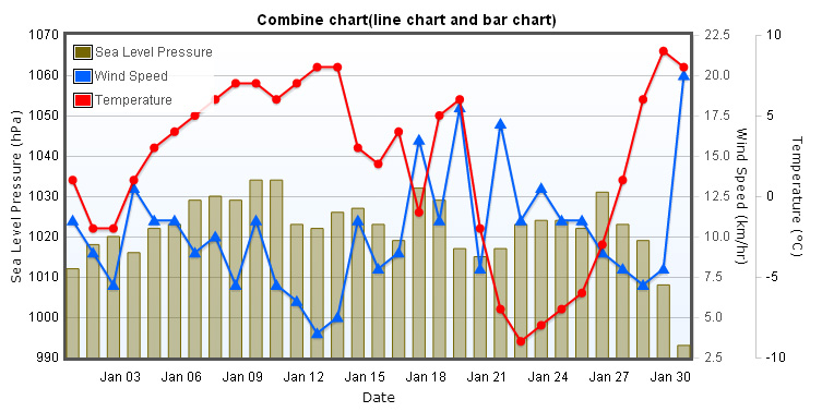
Combine chart(line chart and bar chart)
Include files
The files required for making combine chart.
<script type="text/javascript" src="/js/jquery-1.8.3.min.js"></script>
<!--[if lte IE 8]><script language="javascript" type="text/javascript" src="/js/flot/excanvas.min.js"></script><![endif]-->
<script type="text/javascript" src="/js/flot/jquery.flot.js"></script>
<script type="text/javascript" src="/js/flot/jquery.flot.time.js"></script>
<script type="text/javascript" src="/js/flot/jquery.flot.axislabels.js"></script>
<script type="text/javascript" src="/js/flot/jquery.flot.symbol.js"></script>
Creating data
In this example we used climate data as data source. In the beginning, we create three variables representing temperature、wind speed and sea level pressure respectively, in the x-axis use time series data, we create a function call gd(), this function is used for retrieving timestamps, and in the y-axis we put in the climate data.
//temp
var data1 = [
    [gd(2012, 1, 1), 1], [gd(2012, 1, 2), -2], [gd(2012, 1, 3), -2], [gd(2012, 1, 4), 1], [gd(2012, 1, 5), 3], [gd(2012, 1, 6), 4], [gd(2012, 1, 7), 5], [gd(2012, 1, 8), 6], [gd(2012, 1, 9), 7], [gd(2012, 1, 10), 7], [gd(2012, 1, 11), 6], [gd(2012, 1, 12), 7], [gd(2012, 1, 13), 8], [gd(2012, 1, 14), 8], [gd(2012, 1, 15), 3], [gd(2012, 1, 16), 2], [gd(2012, 1, 17), 4], [gd(2012, 1, 18), -1], [gd(2012, 1, 19), 5], [gd(2012, 1, 20), 6], [gd(2012, 1, 21), -2], [gd(2012, 1, 22), -7], [gd(2012, 1, 23), -9], [gd(2012, 1, 24), -8], [gd(2012, 1, 25), -7], [gd(2012, 1, 26), -6], [gd(2012, 1, 27), -3], [gd(2012, 1, 28), 1], [gd(2012, 1, 29), 6], [gd(2012, 1, 30), 9], [gd(2012, 1, 31), 8]
];

//wind
var data2 = [
    [gd(2012, 1, 1), 11], [gd(2012, 1, 2), 9], [gd(2012, 1, 3), 7], [gd(2012, 1, 4), 13], [gd(2012, 1, 5), 11], [gd(2012, 1, 6), 11], [gd(2012, 1, 7), 9], [gd(2012, 1, 8), 10], [gd(2012, 1, 9), 7], [gd(2012, 1, 10), 11], [gd(2012, 1, 11), 7], [gd(2012, 1, 12), 6], [gd(2012, 1, 13), 4], [gd(2012, 1, 14), 5], [gd(2012, 1, 15), 11], [gd(2012, 1, 16), 8], [gd(2012, 1, 17), 9], [gd(2012, 1, 18), 16], [gd(2012, 1, 19), 11], [gd(2012, 1, 20), 18], [gd(2012, 1, 21), 8], [gd(2012, 1, 22), 17], [gd(2012, 1, 23), 11], [gd(2012, 1, 24), 13], [gd(2012, 1, 25), 11], [gd(2012, 1, 26), 11], [gd(2012, 1, 27), 9], [gd(2012, 1, 28), 8], [gd(2012, 1, 29), 7], [gd(2012, 1, 30), 8], [gd(2012, 1, 31), 20]
];

//sea level pressure
var data3 = [
    [gd(2012, 1, 1), 1012], [gd(2012, 1, 2), 1018], [gd(2012, 1, 3), 1020], [gd(2012, 1, 4), 1016], [gd(2012, 1, 5), 1022], [gd(2012, 1, 6), 1023], [gd(2012, 1, 7), 1029], [gd(2012, 1, 8), 1030], [gd(2012, 1, 9), 1029], [gd(2012, 1, 10), 1034], [gd(2012, 1, 11), 1034], [gd(2012, 1, 12), 1023], [gd(2012, 1, 13), 1022], [gd(2012, 1, 14), 1026], [gd(2012, 1, 15), 1027], [gd(2012, 1, 16), 1023], [gd(2012, 1, 17), 1019], [gd(2012, 1, 18), 1032], [gd(2012, 1, 19), 1029], [gd(2012, 1, 20), 1017], [gd(2012, 1, 21), 1015], [gd(2012, 1, 22), 1017], [gd(2012, 1, 23), 1023], [gd(2012, 1, 24), 1024], [gd(2012, 1, 25), 1024], [gd(2012, 1, 26), 1022], [gd(2012, 1, 27), 1031], [gd(2012, 1, 28), 1023], [gd(2012, 1, 29), 1019], [gd(2012, 1, 30), 1008], [gd(2012, 1, 31), 993]
];

function gd(year, month, day) {
    return new Date(year, month - 1, day).getTime();
}
In the Wind Speed data object, we want it to be shown as line chart, we set lines.show to true. We also use the attribute of data point points.symbol, we set it with value "triangle", it meas that data point symbol will be shown as triangle. We use points.fillColor to fill the data point with the color we want. Then, in the Temperature and Wind Speed data point we use the same configuration. We also set different colors to color attribute, this makes three data groups to be shown with different colors.
The last but not the least, because we`re putting three data groups into one chart, therefor there will be three ticks in the y-axis, so we neet to use yaxis attribute. You can see we used yaxis:2 in the Wind Speed data object, it means that Wind Speed should be plotted against the second y-axis, and in the temperature data object we set yaxis:3, it means that Wind Speed should be plotted against the third y-axis. But, go back to Sea Level Pressure data object, you can see there is no yaxis being set, that`s because Sea Level Pressure should be plotted against the first y-axis, so yaxis attribute is omitted.
Below is the codes of dataset.
var dataset = [
    {
        label: "Sea Level Pressure",
        data: data3,
        color: "#756600",
        bars: {
            show: true,
            align: "center",
            barWidth: 24 * 60 * 60 * 600,
            lineWidth:1
        }
    }, {
        label: "Wind Speed",
        data: data2,
        yaxis: 2,
        color: "#0062FF",
        points: { symbol: "triangle", fillColor: "#0062FF", show: true },
        lines: {show:true}
    }, {
        label: "Temperature",
        data: data1,
        yaxis: 3,
        color: "#FF0000",
        points: { symbol: "circle", fillColor: "#FF0000", show: true },
        lines: { show: true }
    }
];
Chart options
Because we`re using time series data in this example, so we have to set xaxis.mode with value "time", and xaxis.tickSize: [3, "day"] means that tick labels will be shown in three days interval. And because we have used bar chart in this example, we set xaxis.tickLength to zero, this prevents the tick lines in x-axis from showing up. Any attributes that start with axisLabel are used for axis labels. In the end, we set xaxis.color with the value "black", to make the color of tick labels black.
     xaxis: {
        mode: "time",
        tickSize: [3, "day"],
        tickLength: 0,
        axisLabel: "Date",
        axisLabelUseCanvas: true,
        axisLabelFontSizePixels: 12,
        axisLabelFontFamily: 'Verdana, Arial',
        axisLabelPadding: 10,
        color: "black"
    }
In general, there is only one data series in one chart, only a y-axis. In this case if we want to configure options in y-axis, we will use yaxis:{}. And in this example, we used three data series, as a result, there will be three y-axis, in this case if we want to configure options in y-axis, we have to use yaxes:[] instead, and the first object in yaxes array is correspond to yaxis:1 in dataset, and the second one is correspond to yaxis:2 in dataset, and so on.
By default, the tick labels of y-axis will appear on the left of the chart, but this time we have three y-axes, if they all appear on the left the chart will be too crowded, so we move two of them to the right side of the chart. To achieve this we use axis.position, you can set it with value "left" or "right". We also set axis.color to "black" to make tick labels show with black fonts.
In the final part, we set max:1070 in the first object, because it represents bar chart of Sea Level Pressure, if we don`t set the maximum value on the scale, the bar chart will be overlapped with other two line charts, for users, it will be difficult to see the details of the chart, so we set max to 1070 to make the bar chart appear in the middle of the bottom.
Below is the codes of y-axis options.
     yaxes: [
        //yaxis:1
        {
            position: "left",
            max: 1070,
            color: "black",
            axisLabel: "Sea Level Pressure (hPa)",
            axisLabelUseCanvas: true,
            axisLabelFontSizePixels: 12,
            axisLabelFontFamily: 'Verdana, Arial',
            axisLabelPadding: 3
        },
        //yaxis:2
        {
            position: "right",
            clolor: "black",
            axisLabel: "Wind Speed (km/hr)",
            axisLabelUseCanvas: true,
            axisLabelFontSizePixels: 12,
            axisLabelFontFamily: 'Verdana, Arial',
            axisLabelPadding: 3
        },
        //yaxis:3
        {
            position: "right",
            color: "black",
            axisLabel: "Temperature (°C)",
            axisLabelUseCanvas: true,
            axisLabelFontSizePixels: 12,
            axisLabelFontFamily: 'Verdana, Arial',
            axisLabelPadding: 3
        }
    ]
In the grid options, because we have used tooltip, we set grid.hoverable to true, so "plothover" event will be trigered when mouse move over data point, and then tooltip will show up. And grid.borderWidth is the width of chart border, grid.backgroundColor is the background color of the chart.
        legend: {
            noColumns: 1,
            labelBoxBorderColor: "#000000",
            position: "nw"
        }

        grid: {
            hoverable: true,
            borderWidth: 3,
            backgroundColor: { colors: ["#ffffff", "#EDF5FF"] }
        }
Creating tooltip
What tooltip does is that when you move your mouse over the data point of the chart, tooltip will appear and show detailed information, such as the value of x-axis or y-axis. In Flot, you need to create your own tooltip.First, we have to bind "plothover" event, the event will pass item object, it contains all the information that we need, such as item.series.label is the label of data data series, and you can get the values of x-axis or y-axis from item.datapoint, below is the codes of tooltip.
        var previousPoint = null, previousLabel = null;

        $.fn.UseTooltip = function () {
            $(this).bind("plothover", function (event, pos, item) {
                if (item) {
                    if ((previousLabel != item.series.label) || (previousPoint != item.dataIndex)) {
                        previousPoint = item.dataIndex;
                        previousLabel = item.series.label;
                        $("#tooltip").remove();

                        var x = item.datapoint[0];
                        var y = item.datapoint[1];

                        var color = item.series.color;
                        var date = "Jan " + new Date(x).getDate();

                        var unit = "";

                        if (item.series.label == "Sea Level Pressure") {
                            unit = "hPa";
                        } else if (item.series.label == "Wind Speed") {
                            unit = "km/hr";
                        } else if (item.series.label == "Temperature") {
                            unit = "°C";
                        }

                        showTooltip(item.pageX, item.pageY, color,
                                    "" + item.series.label + "
" + date +
                                    " : " + y + " " + unit + "");
                    }
                } else {
                    $("#tooltip").remove();
                    previousPoint = null;
                }
            });
        };


        function showTooltip(x, y, color, contents) {
            $('<div id="tooltip">' + contents + '</div>').css({
                position: 'absolute',
                display: 'none',
                top: y - 40,
                left: x - 120,
                border: '2px solid ' + color,
                padding: '3px',
                'font-size': '9px',
                'border-radius': '5px',
                'background-color': '#fff',
                'font-family': 'Verdana, Arial, Helvetica, Tahoma, sans-serif',
                opacity: 0.9
            }).appendTo("body").fadeIn(200);
        }
The final step
In the end, we call $.plot and pass dataset and options into it, then we call UseTootip(), the chart is completed. You can download complete javascript codes of this example in here.
        $(document).ready(function () {
            $.plot($("#flot-placeholder"), dataset, options);
            $("#flot-placeholder").UseTooltip();
        });