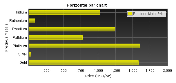
This chapter uses prices of precious metals, gold、platinum、silver and palladium price as data, we will also introduce how to use gradient color in bar charts, and how to change the position of chart legend.
Horizontal bar chart
Horizontal bar chart data
As usual, we put a placeholder in the page, and specify width and height to it, you can use style for doing this or specify a CSS class.
        <style type="text/css">
        .mychart{
           width:300px;
           height:150px;
        }
        </style>
        <div id="flot-placeholder" class="mychart"></div>
        var rawData = [
            [1582.3, 0], //Gold
            [28.95, 1],  //Silver
            [1603, 2],   //Platinum
            [774, 3],    //Palladium
            [1245, 4],  //Rhodium
            [85, 5],      //Ruthenium
            [1025, 6]    //Iridium
        ];

        var dataSet = [
            { label: "Precious Metal Price", data: rawData, color: "#AB5800" }
        ];
        var ticks = [
            [0, "Gold"], [1, "Silver"], [2, "Platinum"], [3, "Palldium"], [4, "Rhodium"], [5, "Ruthenium"], [6, "Iridium"]
        ];
Horizontal bar chart options
When you`re making horizontal bar charts, bars.horizontal must be set to true, if it`s not, it will come out as bar cahrt. In this example we used bars.fillColor, this attribute can be set with a single color (like gba(255, 255, 255, 0.8)) or gradient color, we use the second one. Below shows you how to make a gradient color.
{ colors: [ color1, color2, ... ] }
{ colors: [ { opacity: 0.8 }, { opacity: 0.1 } ] }
        bars: {
            align: "center",
            barWidth: 0.5,
            horizontal: true,
            fillColor: { colors: [{ opacity: 0.5 }, { opacity: 1}] },
            lineWidth: 1
        }
We want to make tick labels of x-axis to show as currency format, we used jQuery Number Formatter plugin, to change tick labels we can use axis.tickFormatter, there are two parameters passed into this function, the tick value and an axis object, and should return a string. You can download jQuery Number Formatter Here.
You can set axis labels by using axis.axisLabel, you also need to include jquery.flot.axislabels.js plugin.
Below is the codes of axis options.
        xaxis: {
            axisLabel: "Price (USD/oz)",
            axisLabelUseCanvas: true,
            axisLabelFontSizePixels: 12,
            axisLabelFontFamily: 'Verdana, Arial',
            axisLabelPadding: 10,
            max: 2000,
            tickColor: "#5E5E5E",
            tickFormatter: function (v, axis) {
                return $.formatNumber(v, { format: "#,###", locale: "us" });
            },
            color:"black"
        }

        yaxis: {
            axisLabel: "Precious Metals",
            axisLabelUseCanvas: true,
            axisLabelFontSizePixels: 12,
            axisLabelFontFamily: 'Verdana, Arial',
            axisLabelPadding: 3,
            tickColor: "#5E5E5E",
            ticks: ticks,
            color:"black"
        }
        legend: {
            noColumns: 0,
            labelBoxBorderColor: "#858585",
            position: "ne"
        }
Calling $.plot
In the end, we pass dataSet and options variables into $.plot.
        $(document).ready(function () {
            $.plot($("#flot-placeholder"), dataSet, options);
            $("#flot-placeholder").UseTooltip();
        });
Complete codes of this example
<!DOCTYPE html PUBLIC "-//W3C//DTD XHTML 1.0 Transitional//EN" "http://www.w3.org/TR/xhtml1/DTD/xhtml1-transitional.dtd">

<html xmlns="http://www.w3.org/1999/xhtml">
<head>
    <title></title>
    <script src="/js/lib/jquery-1.8.3.min.js" type='text/javascript'></script>
    <!--[if lte IE 8]><script language="javascript" type="text/javascript" src="/js/flot/excanvas.min.js"></script><![endif]-->

    <script type="text/javascript" src="/js/flot/jquery.flot.min.js"></script>
    <script type="text/javascript" src="/js/flot/jquery.flot.axislabels.js"></script>
    <script type="text/javascript" src="/js/flot/jshashtable-2.1.js"></script>
    <script type="text/javascript" src="/js/flot/jquery.numberformatter-1.2.3.min.js"></script>
    <script type="text/javascript">
        //******* Precious Metal Price - HORIZONTAL BAR CHART
        var rawData = [[1582.3, 0], [28.95, 1],[1603, 2],[774, 3],[1245, 4], [85, 5],[1025, 6]];
        var dataSet = [{ label: "Precious Metal Price", data: rawData, color: "#E8E800" }];
        var ticks = [[0, "Gold"], [1, "Silver"], [2, "Platinum"], [3, "Palldium"], [4, "Rhodium"], [5, "Ruthenium"], [6, "Iridium"]];

        var options = {
            series: {
                bars: {
                    show: true
                }
            },
            bars: {
                align: "center",
                barWidth: 0.5,
                horizontal: true,
                fillColor: { colors: [{ opacity: 0.5 }, { opacity: 1}] },
                lineWidth: 1
            },
            xaxis: {
                axisLabel: "Price (USD/oz)",
                axisLabelUseCanvas: true,
                axisLabelFontSizePixels: 12,
                axisLabelFontFamily: 'Verdana, Arial',
                axisLabelPadding: 10,
                max: 2000,
                tickColor: "#5E5E5E",
                tickFormatter: function (v, axis) {
                    return $.formatNumber(v, { format: "#,###", locale: "us" });
                },
                color: "black"
            },
            yaxis: {
                axisLabel: "Precious Metals",
                axisLabelUseCanvas: true,
                axisLabelFontSizePixels: 12,
                axisLabelFontFamily: 'Verdana, Arial',
                axisLabelPadding: 3,
                tickColor: "#5E5E5E",
                ticks: ticks,
                color: "black"
            },
            legend: {
                noColumns: 0,
                labelBoxBorderColor: "#858585",
                position: "ne"
            },
            grid: {
                hoverable: true,
                borderWidth: 2,
                backgroundColor: { colors: ["#171717", "#4F4F4F"] }
            }
        };

        $(document).ready(function () {
            $.plot($("#flot-placeholder"), dataSet, options);
            $("#flot-placeholder").UseTooltip();
        });

        var previousPoint = null, previousLabel = null;

        $.fn.UseTooltip = function () {
            $(this).bind("plothover", function (event, pos, item) {
                if (item) {
                    if ((previousLabel != item.series.label) ||
                 (previousPoint != item.dataIndex)) {
                        previousPoint = item.dataIndex;
                        previousLabel = item.series.label;
                        $("#tooltip").remove();

                        var x = item.datapoint[0];
                        var y = item.datapoint[1];

                        var color = item.series.color;
                        //alert(color)
                        //console.log(item.series.xaxis.ticks[x].label);

                        showTooltip(item.pageX,
                        item.pageY,
                        color,
                        "<strong>" + item.series.label + "</strong><br>" + item.series.yaxis.ticks[y].label +
                        " : <strong>" + $.formatNumber(x, { format: "#,###", locale: "us" }) + "</strong> USD/oz");
                    }
                } else {
                    $("#tooltip").remove();
                    previousPoint = null;
                }
            });
        };

        function showTooltip(x, y, color, contents) {
            $('<div id="tooltip">' + contents + '</div>').css({
                position: 'absolute',
                display: 'none',
                top: y - 10,
                left: x + 10,
                border: '2px solid ' + color,
                padding: '3px',
                'font-size': '9px',
                'border-radius': '5px',
                'background-color': '#fff',
                'font-family': 'Verdana, Arial, Helvetica, Tahoma, sans-serif',
                opacity: 0.9
            }).appendTo("body").fadeIn(200);
        }
    </script>
</head>
<body>
    <div style="width:450px;height:300px;text-align:center;margin:10px">
        <div id="flot-placeholder" style="width:100%;height:100%;"></div>
    </div>
</body>
</html>