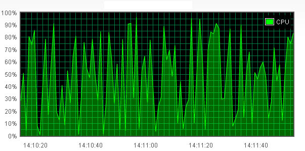
There are many situations you could use the realtime update chart,such as CPU
loading chart、memory usage chart or online users chart, in this example we will
show you how to make realtime update chart for CPU loading.
CPU loading realtime update chart
Required files
All the required files need to be put in <head>, because we are making time series chart, so you need to include jquery.flot.time.js, and you also need to include jquery.flot.axislabels.js plugin to use axis label.Below are the required files.
        <script type="text/javascript" src="/js/jquery-1.8.3.min.js"></script>
         <!--[if lte IE 8]><script language="javascript" type="text/javascript" src="/js/flot/excanvas.min.js"></script><![endif]-->
        <script type="text/javascript" src="/js/flot/jquery.flot.js"></script>
        <script type="text/javascript" src="/js/flot/jquery.flot.time.js"></script>
        <script type="text/javascript" src="/js/flot/jquery.flot.axislabels.js"></script>
Placeholder
When all the required files are set, next is to decide where you want your chart to appear, you can choose anywhere you want, as long as you put a <div> inside of the <body> tag, and specify an id to it, and don`t forget to specify height and width.
<div id="flot-placeholder" style="width:600px;height:300px"></div>
        .legendLabel
        {
            color:White;
        }
Creating data
In this example we use up to 100 data points, for convenience, we create a function to produce the data points we need. First, we create a variable call totalPoints, this is the total of data points we will use, and variable updateInterval, this represents the interval of each update, we set this variable to 1000 to make the chart update every one second. We also create another variable call "now", this is used to get the milliseconds of date object. Then we can use loop to create data points.
        var data = [];
        var totalPoints = 100;
        var updateInterval = 1000;
        var now = new Date().getTime();

        function GetData() {
            data.shift(); //to remove first item of array

            while (data.length < totalPoints) {
                var y = Math.random() * 100;
                var temp = [now += updateInterval, y]; //data format [x, y]

                data.push(temp);
            }
        }
        [
          [1366080403385, 27.774008526466787], [1366080404385, 16.122459364123642],
          [1366080405385, 36.352222855202854], [1366080406385, 79.74009534809738],
          [1366080407385, 15.236222557723522], [1366080408385, 92.99933034926653], ...
        ]
Realtime update options
We set series.lines.show to true to make lines appear,also we set series.lines.fill to true to fill the shape,and series.lines.lineWidth can control the thickness of the line.
        series: {
            lines: {
                show: true,
                lineWidth: 1.2,
                fill: true
            }
        }
        xaxis: {
            mode: "time",
            tickSize: [2, "second"],
            tickFormatter: function (v, axis) {
                var date = new Date(v);

                if (date.getSeconds() % 20 == 0) {
                    var hours = date.getHours() < 10 ? "0" + date.getHours() : date.getHours();
                    var minutes = date.getMinutes() < 10 ? "0" + date.getMinutes() : date.getMinutes();
                    var seconds = date.getSeconds() < 10 ? "0" + date.getSeconds() : date.getSeconds();

                    return hours + ":" + minutes + ":" + seconds;
                } else {
                    return "";
                }
            },
            axisLabel: "Time",
            axisLabelUseCanvas: true,
            axisLabelFontSizePixels: 12,
            axisLabelFontFamily: 'Verdana, Arial',
            axisLabelPadding: 10
        }
        yaxis: {
            min: 0,
            max: 100,
            tickFormatter: function (v, axis) {
                if (v % 10 == 0) {
                    return v + "%";
                } else {
                    return "";
                }
            },
            axisLabel: "CPU loading",
            axisLabelUseCanvas: true,
            axisLabelFontSizePixels: 12,
            axisLabelFontFamily: 'Verdana, Arial',
            axisLabelPadding: 6
        }
        legend: {
            labelBoxBorderColor: "#fff"
        }

        grid: {
            backgroundColor: "#000000",
            tickColor: "#008040"
        }
Setting up for realtime update
After the data and options is done, the last step is to make the chart have the ability to update periodically. At first, we call GetData() to create initial data, then we call $.plot and pass data and options to it. And we create a function call update(), in this function we repeat the same procedure calling GetData() and $.plot, then we make use of setTimeout to let the chart to update periodically, in the end, we call update(), the chart is ready to work.
        $(document).ready(function () {
            GetData();

            dataset = [
                { label: "CPU", data: data, color: "#00FF00" }
            ];

            $.plot($("#flot-placeholder1"), dataset, options);

            function update() {
                GetData();

                $.plot($("#flot-placeholder1"), dataset, options)
                setTimeout(update, updateInterval);
            }

            update();
        });